Project Highlights
Product Team
Consisted of :
UX · UI Designer; Graphic Designer; Copywriter;
Marketeer and Developer.
Project- Plan
Two weeks of research and analysis, followed by two- weeks of Ideation. Coming behind two weeks of prototyping, before three weeks of implementing and testing.
Methodology
Design Thinking driven, iterative product development: Empathize, Define, Ideate, Prototype and Test.
My Role
I worked on the entire scope of the product design process, from the initial research to conception, all aspects of the user research and the final visual design, interface, and testing.
Designer ·
Researcher ·
Project Overview
Product Vision
The website of the brand KELO.CELL has one year of existence and has been implemented to launch the company’s first product
KELO.CELL Biogel - a skincare silicone gel to manage scars' treatment.
One of the challenges was to develop the new product webpages of the same line (KELO.CELL Protect and KELO.CELL Concealer) as well as, the new product webpage for the brand’s new line (for psoriasis-prone skin).
The other main challenge was to adapt it for mobile navigation something that has been overlooked in the past.
Discovered user issues
The website wasn’t responsive and the website’s structure and navigation weren’t revised according to SEO optimisation and best practices;
The website didn’t address the different stakeholders’ needs (HCPs - Healthcare Professionals, wholesale distributors, and end-users) in terms of the quantity of information provided and the excess of technical language used;
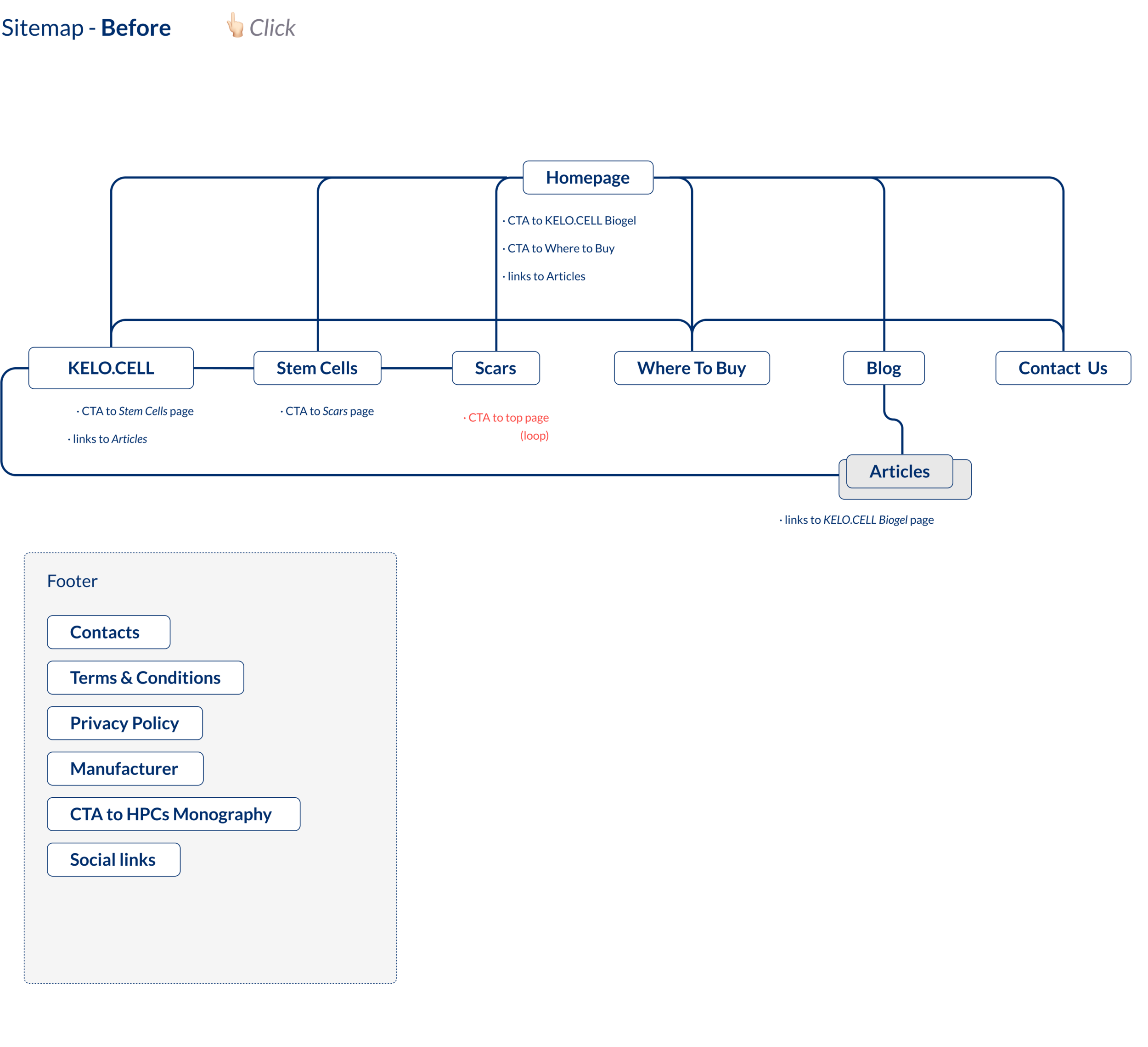
Some pages of the website were in a loop and not linked between them leading to user frustration.
Proposal
The overall user experience needed to be improved to decrease the website’s bounce rate and increase user engagement:
Introducing interactivity to the website by adding micro-animations to elements such as cards and CTA buttons;
Redesigning the website for mobile interfaces introducing new media queries breakpoints and solving responsive design challenges;
Redesign the navigation and user flow of the website and its pages’ structure;
Solution
Outcomes
Improved overall user experience by sorting out navigation issues, responsiveness and cross-device rendering:
Decreased bounce rate (-16%);
Increased average session duration (+32%);
Increase of new users by organic search (+114%).
Discover
Research and Analysis
Empathise
User interviews - stakeholders' views
To better understand the different POVs of diverse stakeholders several interviews were conducted, from which we can highlight the following:
Google Analytics
Through Google Analytics we could understand which kind of devices and operating systems were the most used to access the website.
Define
Information Architecture
Establishing a good IA helps the user find information and complete their tasks and goals. I’ve found that IA is by far the most debated area during the planning phase, therefore the path to success was collaboratively working with two other members of the team to ensure everything has been covered.
Develop
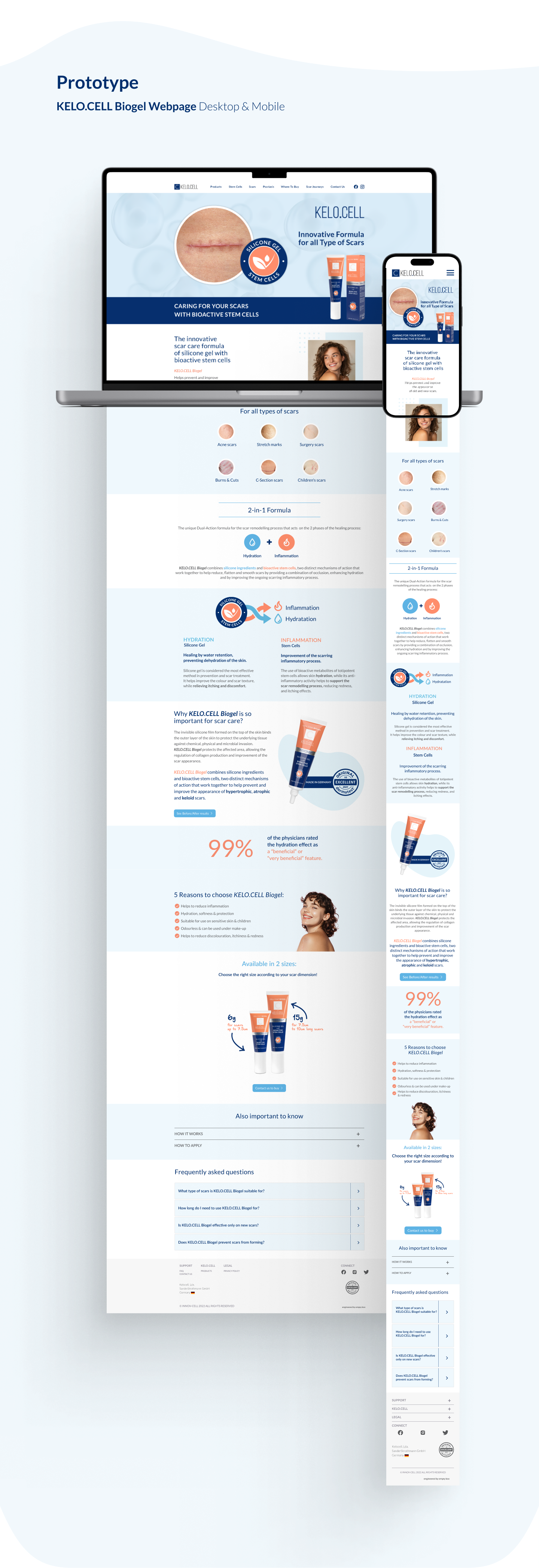
KELO.CELL Biogel Webpage · Desktop
/Before
/After
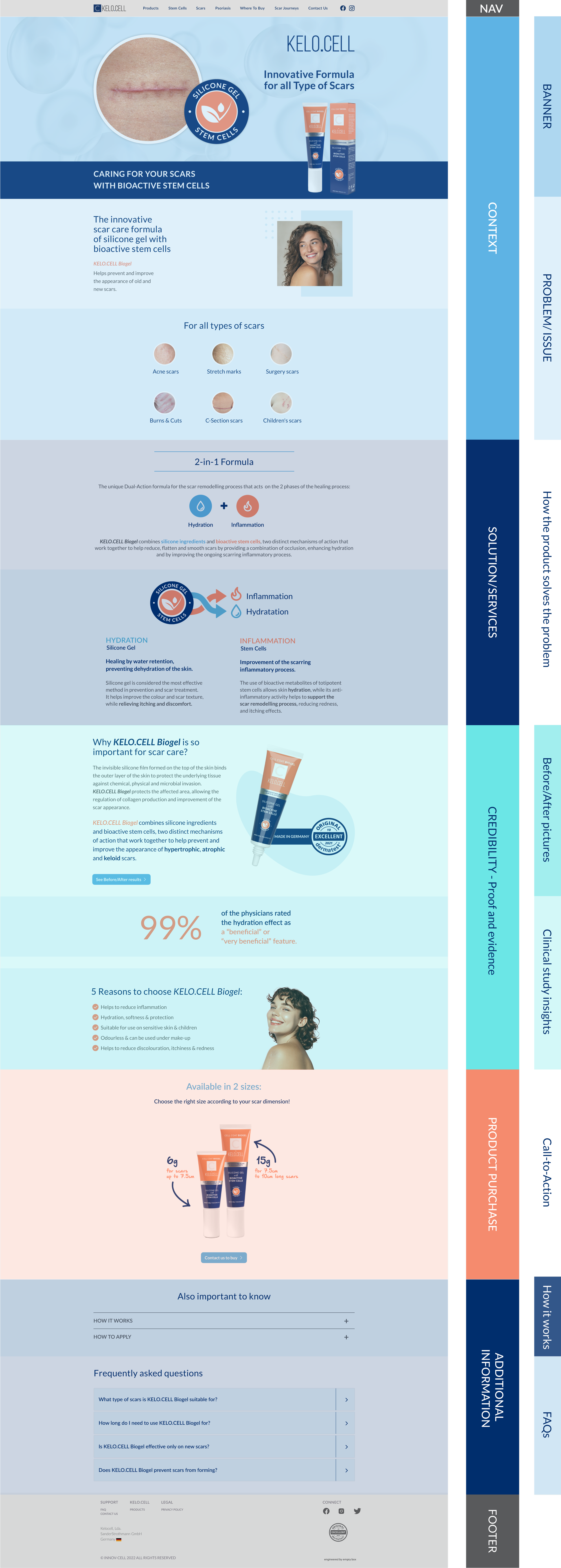
New page structure
Key modifications and new features
KELO.CELL Biogel Webpage · Mobile
Content
The typography sizes were reviewed. The content was edited to be clear and relevant.
Visual elements such as graphics and icons were used to reinforce the written content.
/Before
/After
CTA Button
Edit content seeking both written and visual clarity,
to maximise the effective use of the CTA button.
/Before
/After
Footer
Organising the information displayed on the Footer by categories is essential for better discoverability from the users.
/Before
/After
Key modifications and new features
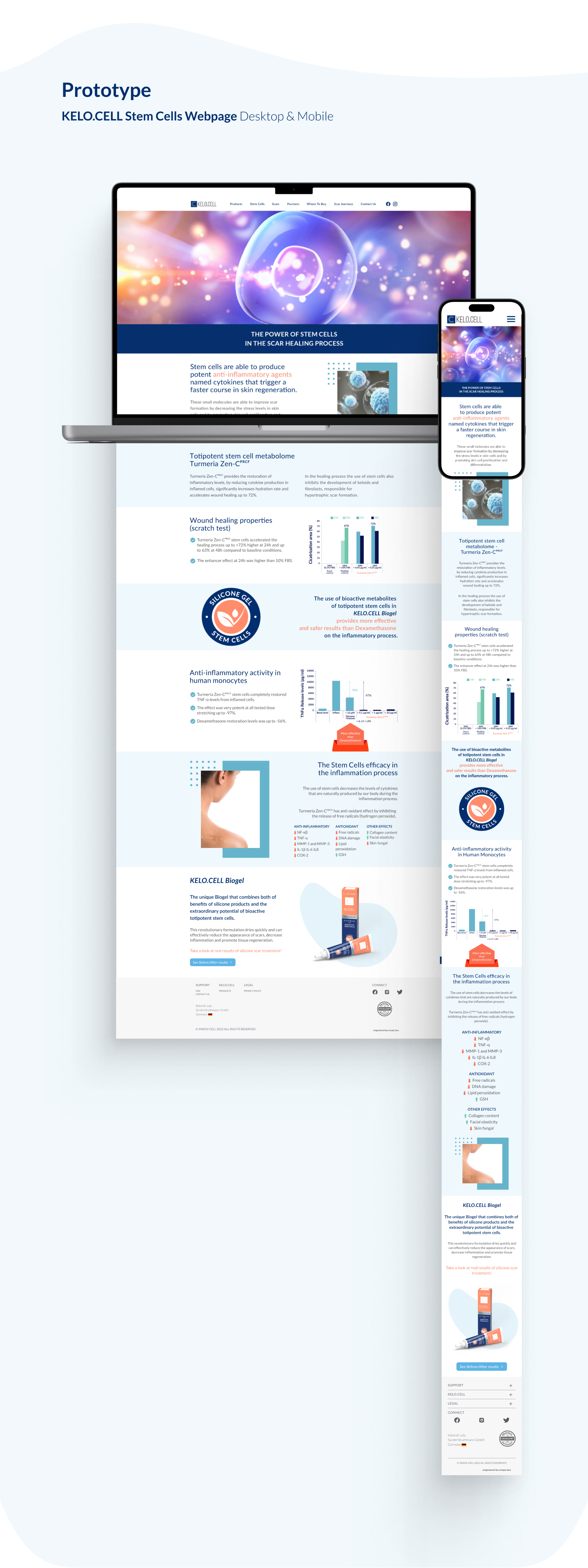
KELO.CELL Scars Webpage · Mobile
Cards
Interactive cards with thumbnails to condense specific information.
Interactive cards that work as buttons that enable the user to access specific content.
Reinforced claims with credible clinical before/after photos in dynamic cards.
Hierarchy & Contrast
Display clinical study highlights to reinforce claims.
Sleeknote
Creation of a new feature, a sleek note that adds value by giving a free downloadable monograph whilst capturing users’ data for future business contact as a conversion rate optimisation tool.
Deliver
Visual System · Colours
Primary Colours
Used across all the interactive elements such as CTAs, links, active states, etc.
Secondary Colours
Used alongside the primary colours
to indicate to the users it is the secondary focus.
Tertiary Colours
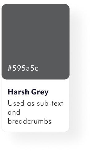
Used to support primary colours in backgrounds, text, colours, separators, models, etc.


